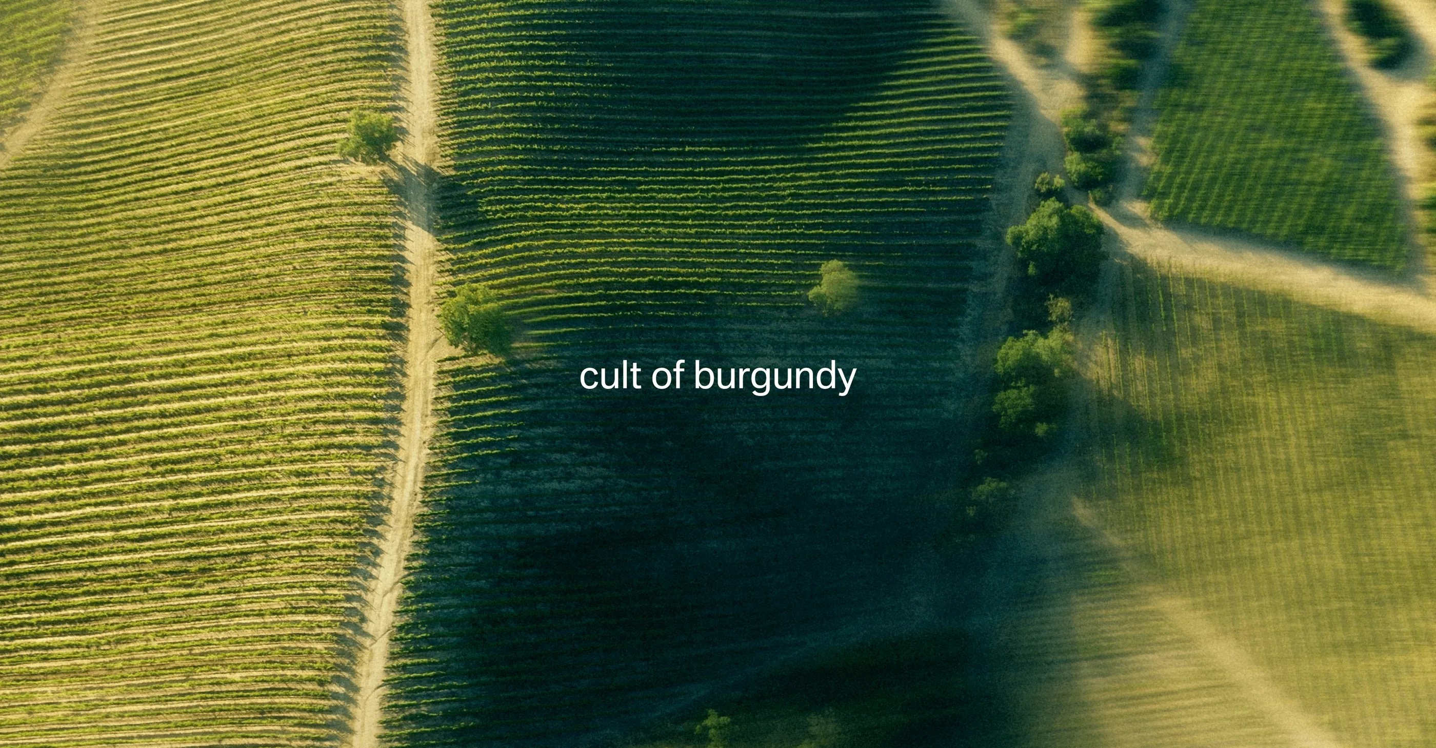
For Simple, NAVY developed the name and visual identity for Cult of Burgundy, a premium Burgundy wine collection.
Our task was to create a distinctive identity for the new premium category while maintaining a clear connection to the Simple brand. The project encompassed concept development, naming, logo design and a comprehensive visual identity system.
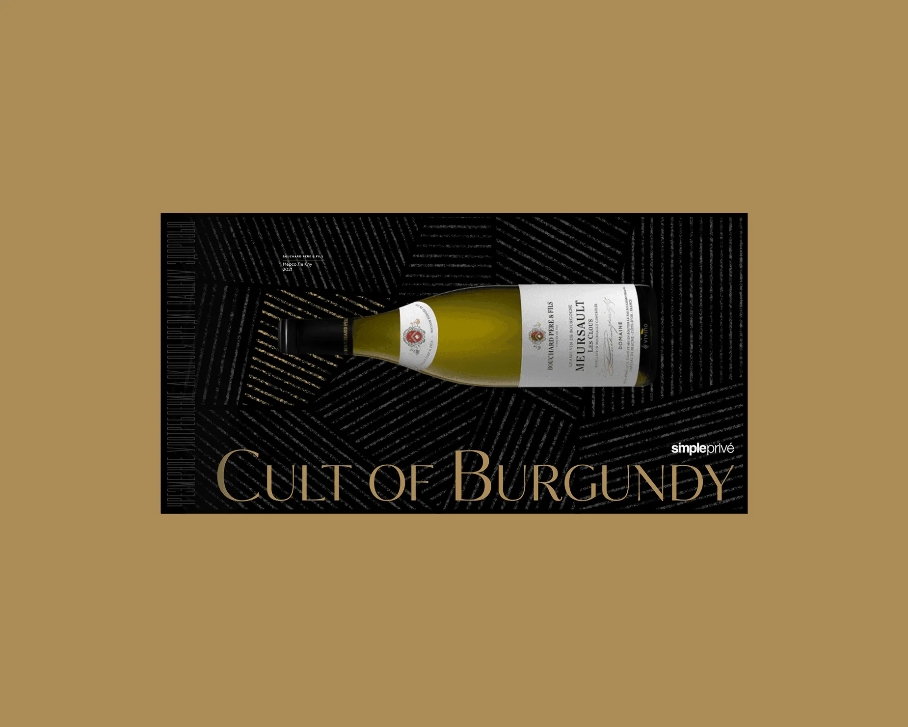
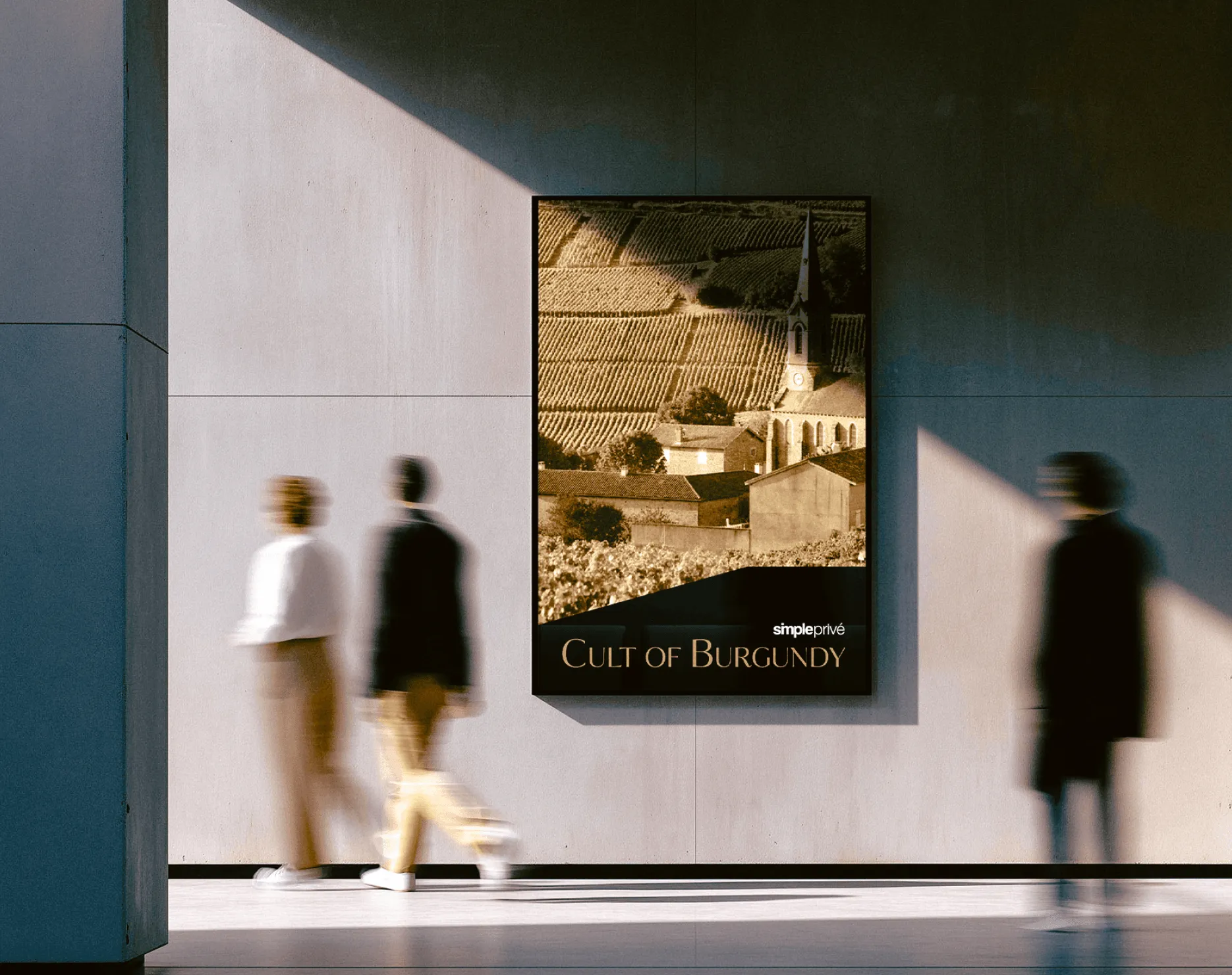
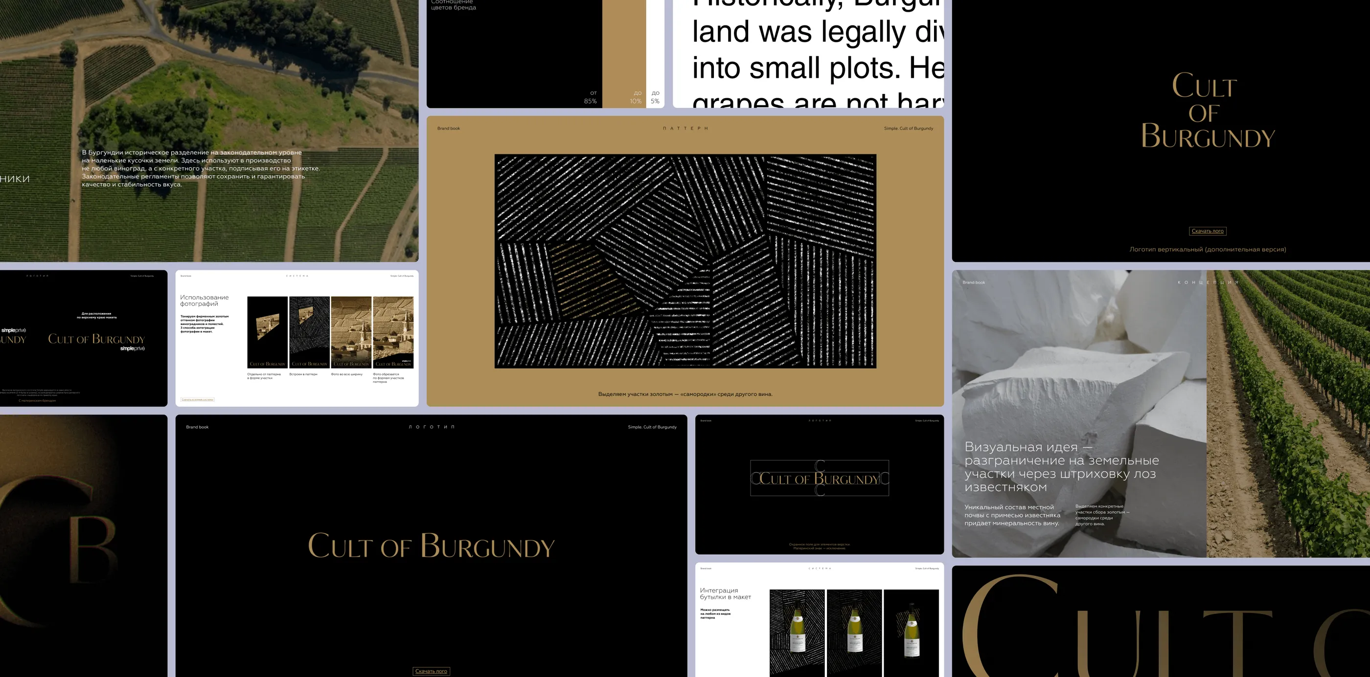
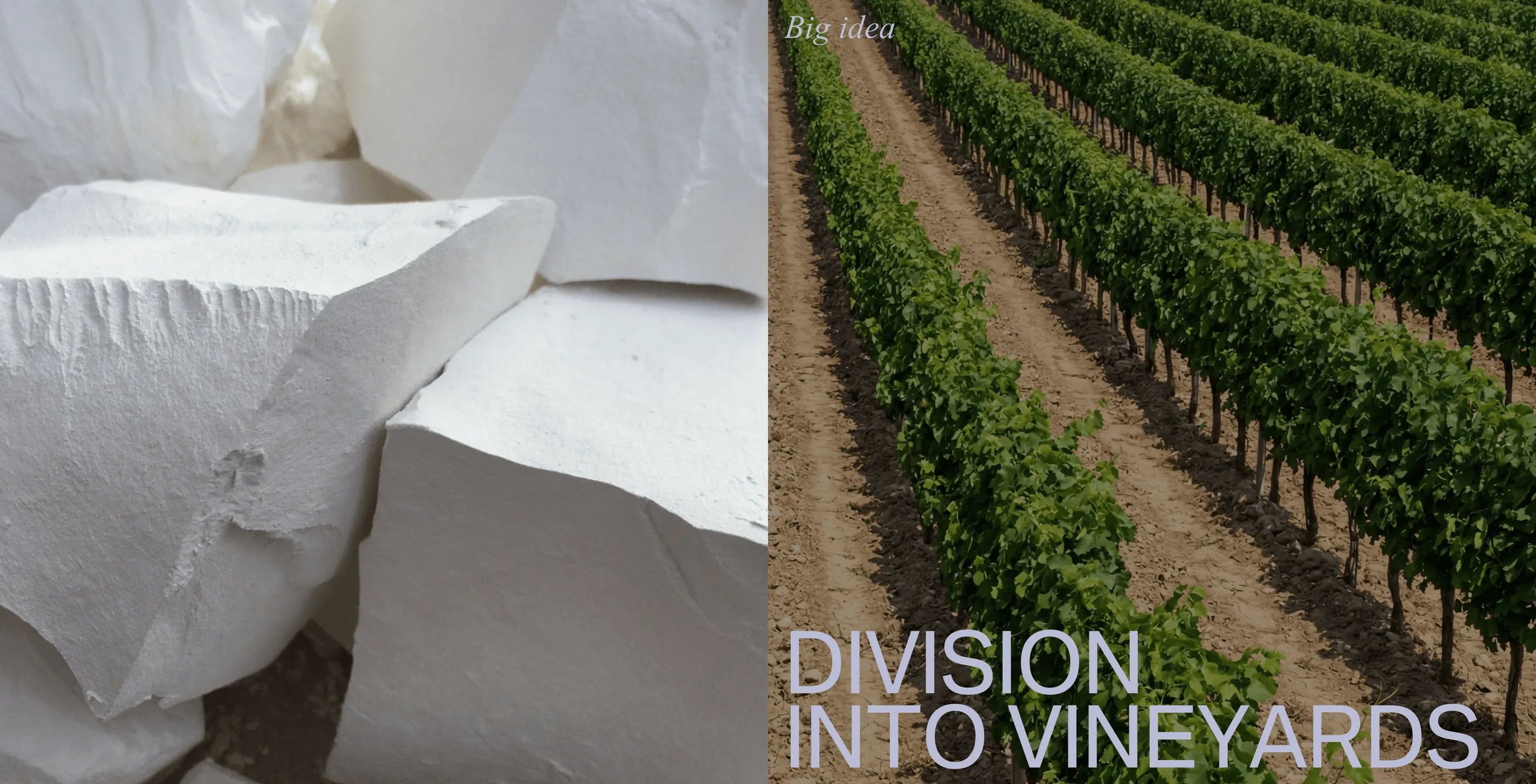
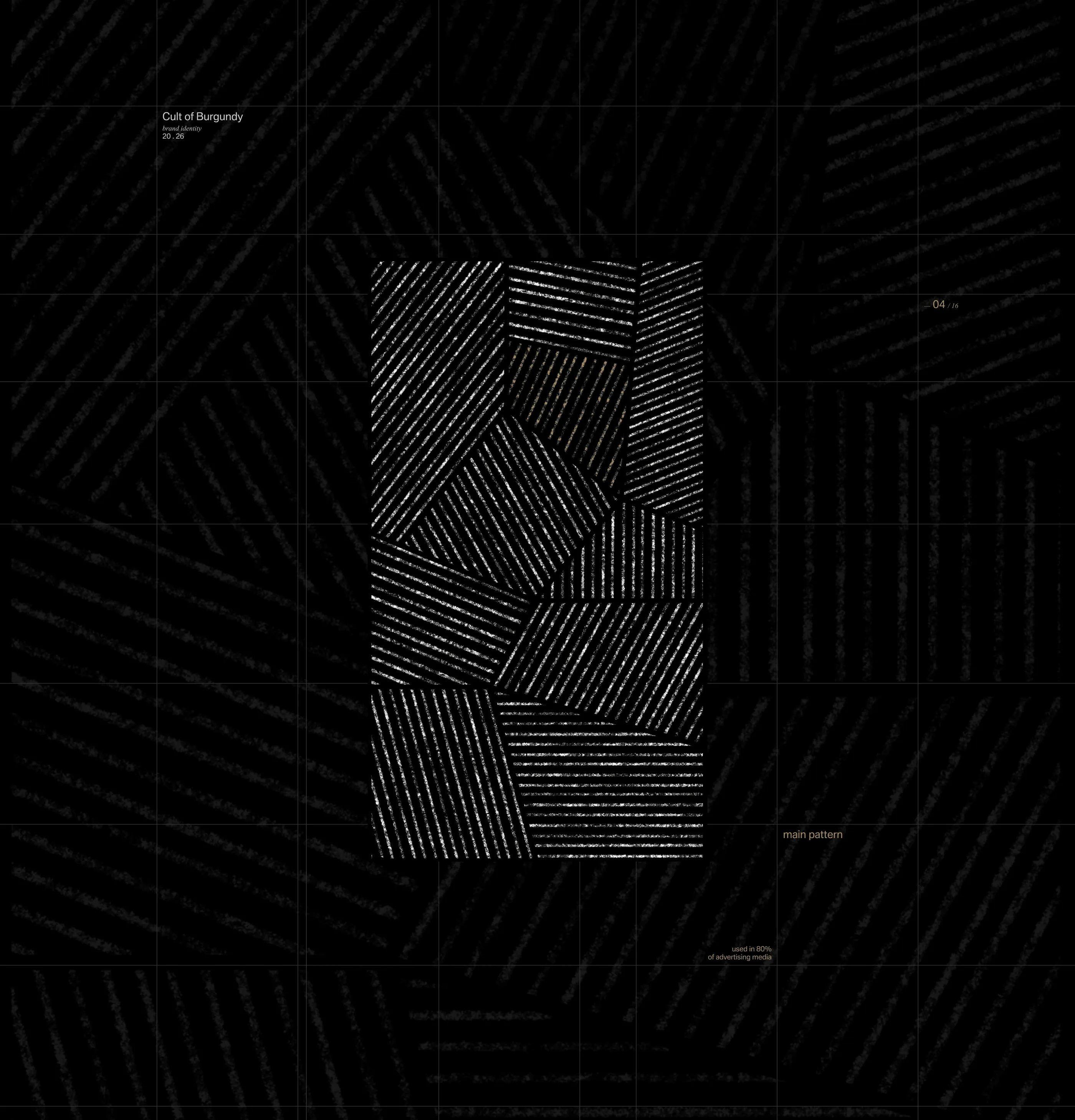
The identity was inspired by extensive research into the Burgundy region. The historic division of its vineyards into small plots became the foundation of the brand pattern, while the texture of the region's limestone soils—one of the defining elements of Burgundy's terroir—inspired its signature graphic hatching.We created the name Cult of Burgundy, reflecting the unique appreciation Burgundy wines inspire among enthusiasts while naturally extending Simple's existing brand architecture.
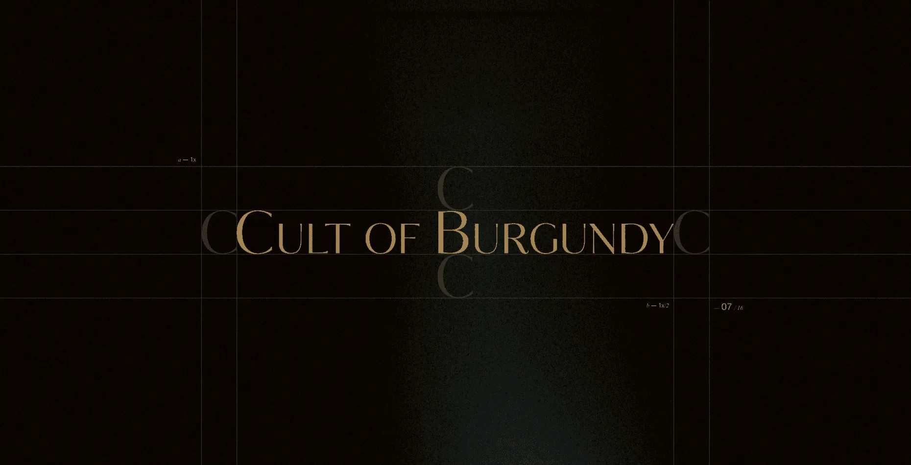
We created the name Cult of Burgundy, reflecting the unique appreciation Burgundy wines inspire among enthusiasts while naturally extending Simple's existing brand architecture.
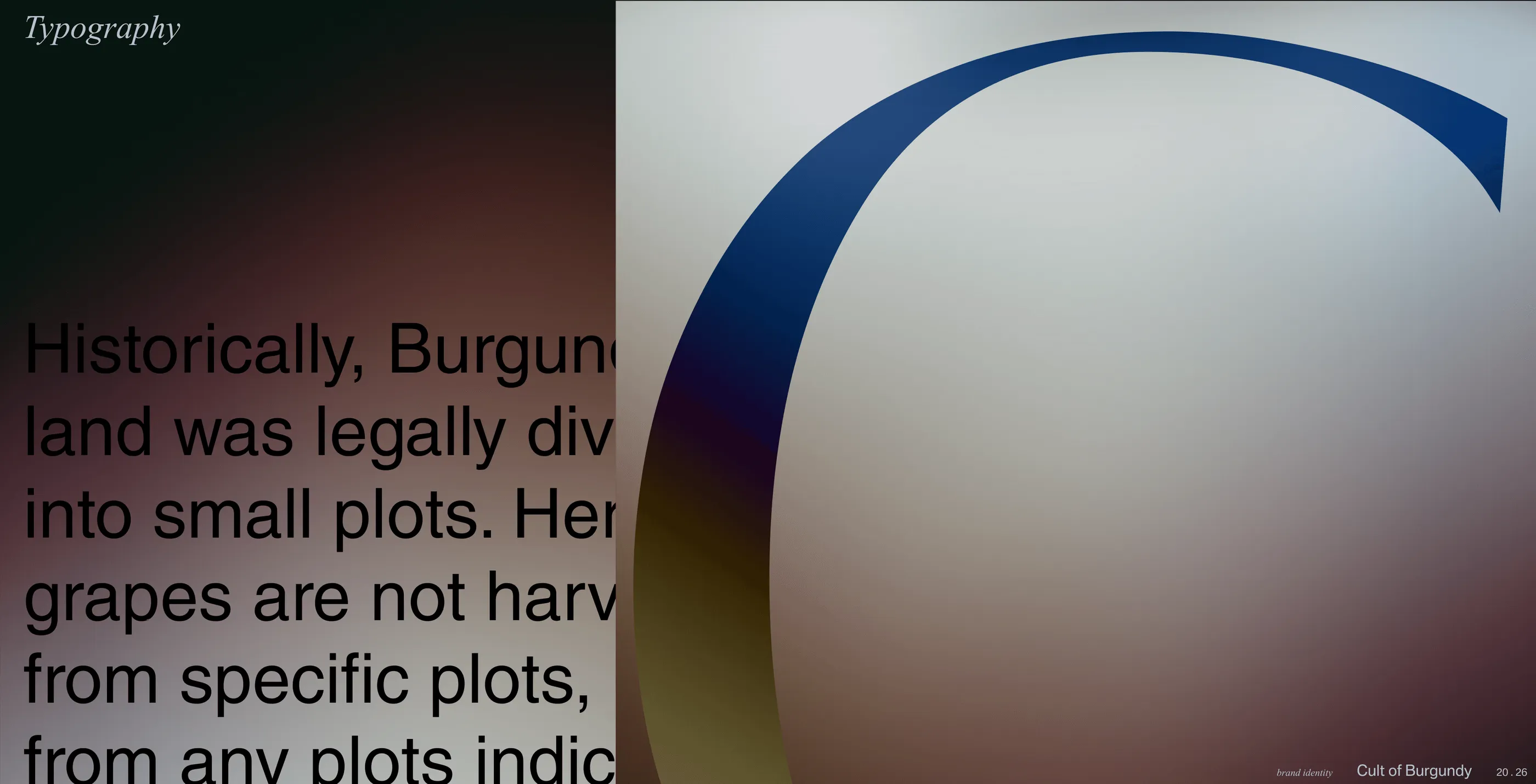
The logo is built around a classic serif typeface, emphasizing the prestige and rich heritage of the region. At the same time, the identity retains Simple's corporate typography across brand communications, ensuring visual consistency while establishing Cult of Burgundy as a distinct collection.

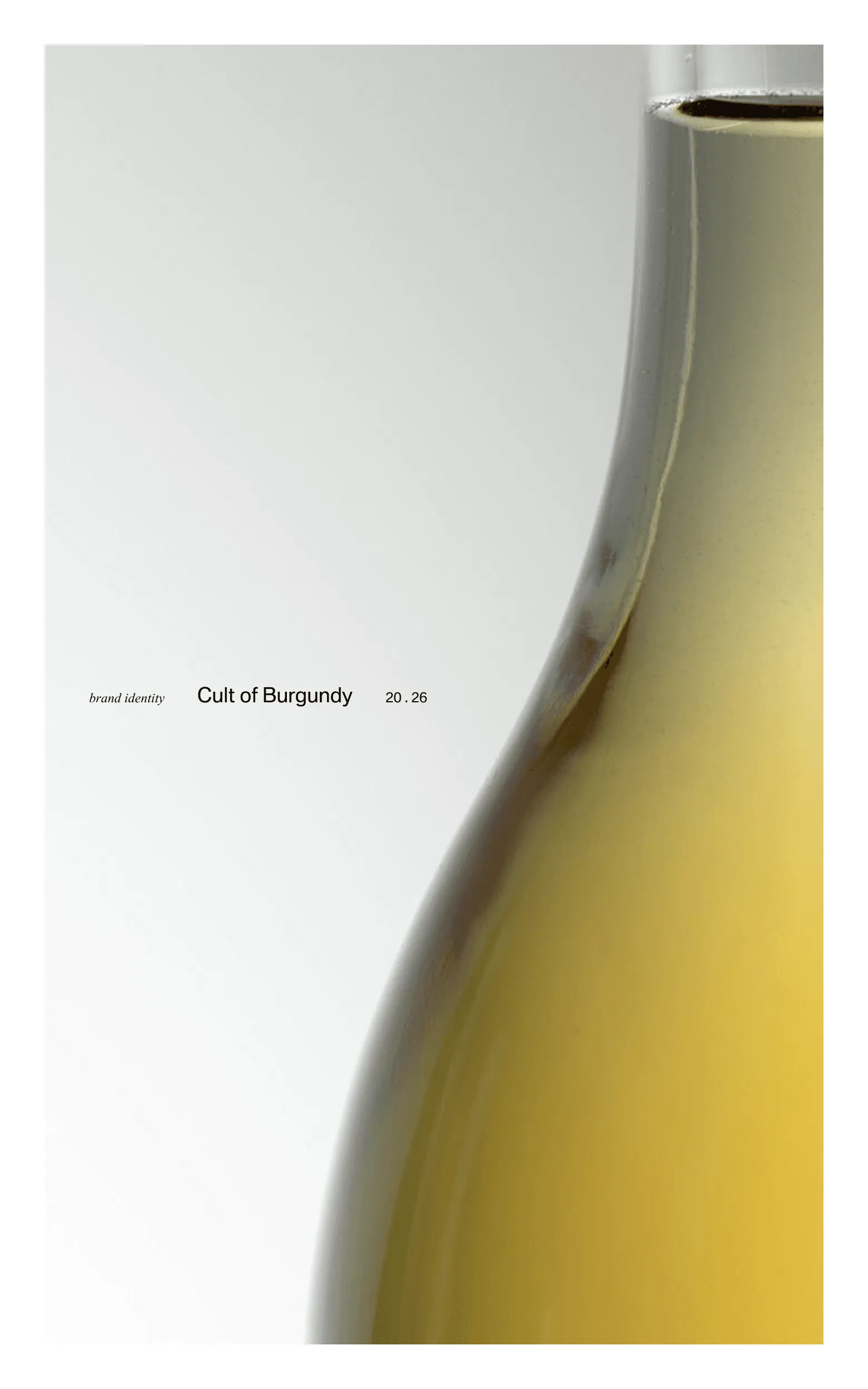
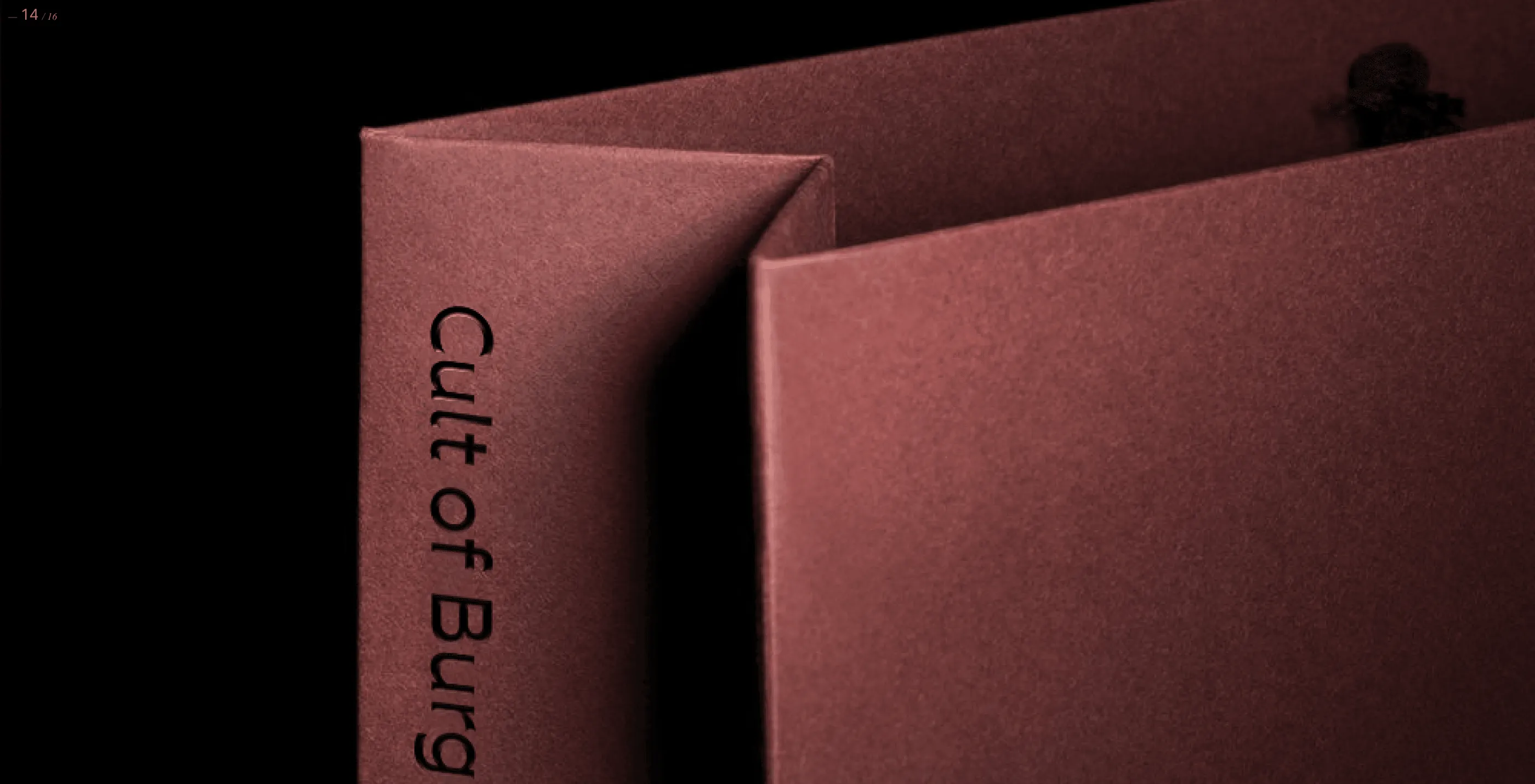
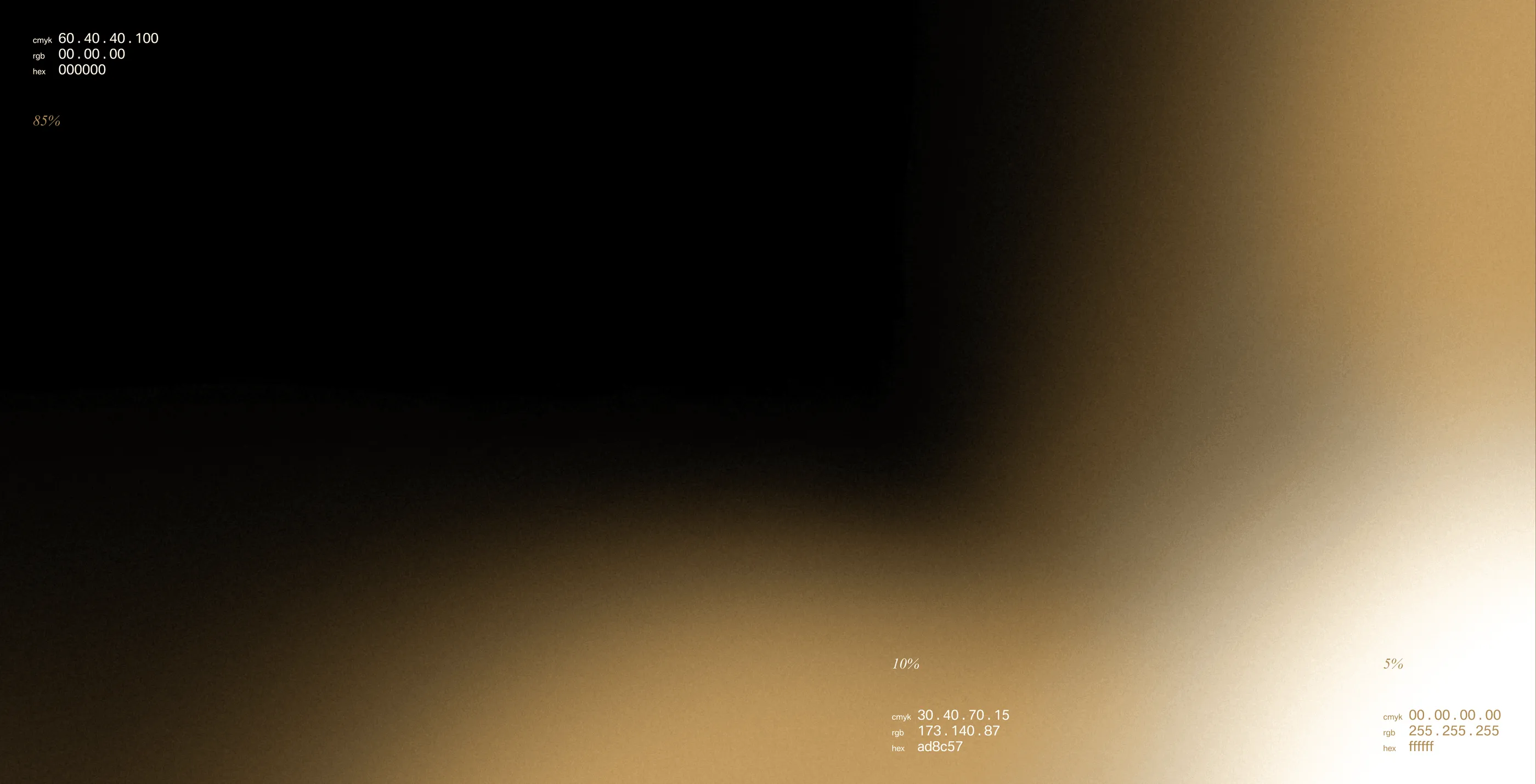
The project also included the development of a monogram, colour palette, pattern system, photography guidelines and branded applications. All elements were brought together in a comprehensive brand guideline covering the use of the visual identity across both digital and print communications.