Värd is a home appliance brand for Russia.
Värd («host» or «owner» in Swedish) refers us to the foundation and main symbol of a home. The confidence, reliability, status, and solidity embedded in the name represent not only the appliance but also the person who acquired it.
The Scandinavian roots of the name convey the product's main consumer values: ease of use and ergonomics, minimalist design, and a high level of quality.
Why did we develop a digital brand zone?
Most digital brand zones are just collections of banners lacking logic—they don’t explain what the brand is, don’t guide users step by step, and don’t sell.
We conducted research, analyzed common mistakes, and created a digital brand zone where the brand is instantly recognizable from the first screen: a unified visual language derived from brand identity, eye-catching details, and clearly highlighted USPs.
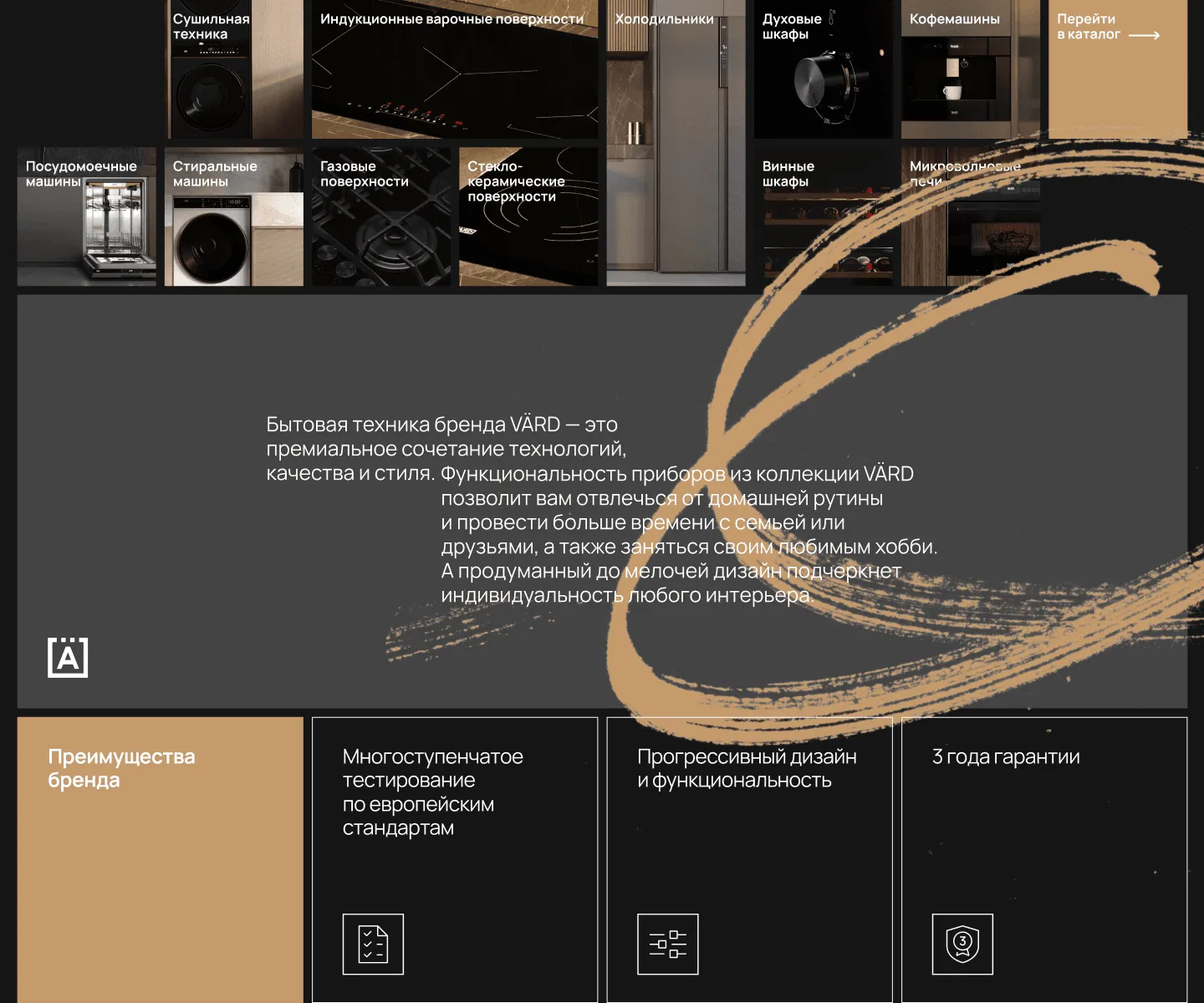
The modular system from the brand book serves as the foundation for the digital brand zone.
The 3×3 grid enables assembling and reconfiguring sections (hero, USPs, model cards) through interchangeable modules: you can adjust the number of benefits, use large images, and display product line names.
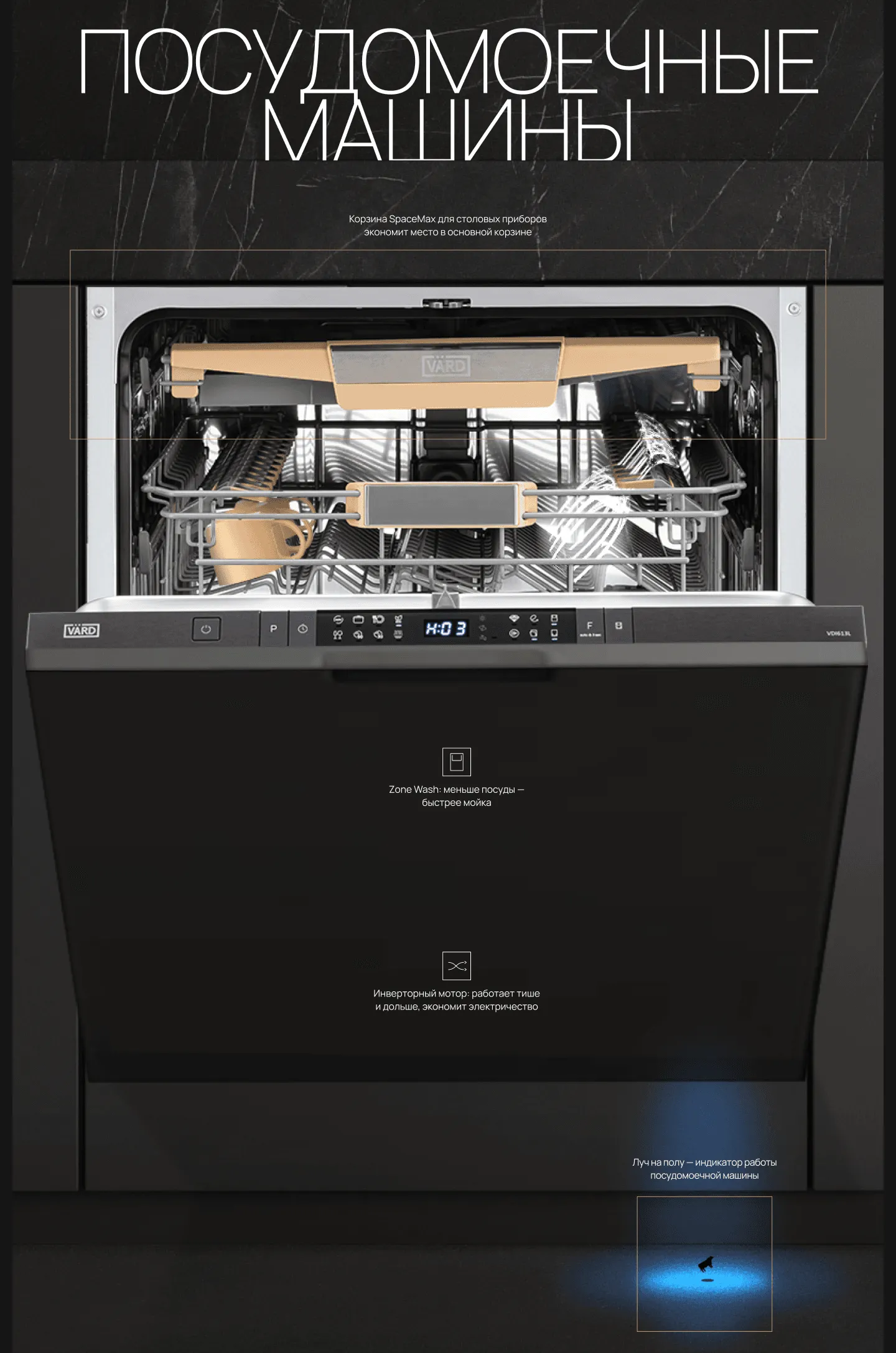
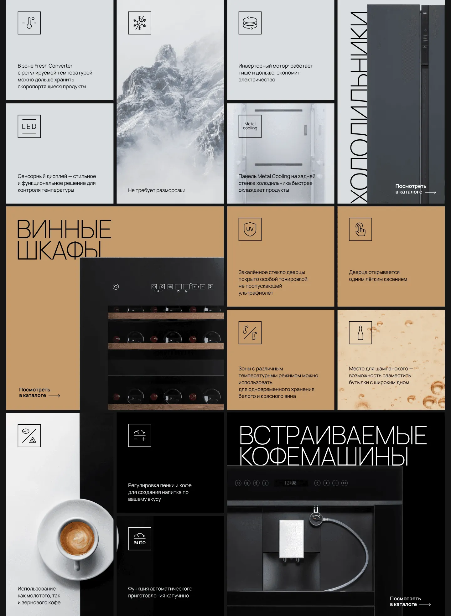
We added subtle guiding frames, lines, and pictograms to link each statement directly to a specific area of the device. These elements direct the viewer’s eye and help instantly convey USPs without unnecessary text.
In the indicator section, we introduced a metaphorical element—a small cow within a beam of light. This serves as an “attention anchor”: a light, memorable touch that makes a technical detail both noticeable and easy to understand.
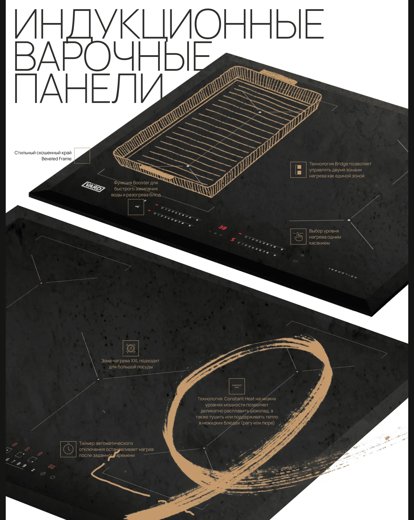
Bold headlines set the tone, while textured brushstrokes visually connect the benefits to the panel's surface.
Digital brand zone at Technopark and Ozon.